Building a Counseling Practice: Counseling Office Encore

As a follow up to our last two posts about creating a counseling office that will wow your clients, I thought I’d post a couple quick videos that were taken of Thriveworks offices in 2009. Enjoy!

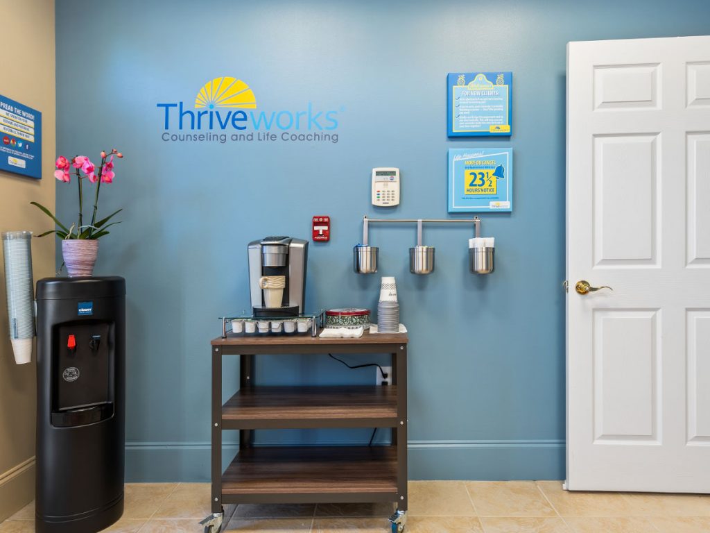
Our office is designed in a way that there are two waiting rooms for greater client privacy. This was a good design, but it also meant buying two coffee bars!
Starting a Counseling Practice: The Counseling Office (Part 2)

In our last article, we talked about “the counseling office” and how while it may be true that therapist’s offices are often really poorly designed, client’s expectations are often a product of what they’ve seen on TV (read the previous post to view pictures of some fantastic TV counseling offices!).

Exceeding Client Expectations

Creating an experience that clients remember and talk about is about creating a unique experience. One way to do this is to have the most expensive office space in town, the best view, the most square feet, and the most lavish and expensive furniture.

Truly, that’s not a bad approach. You’d sure get clients talking! In addition, some studies show that the better your practice location, the less you’ll need to spend on advertising (I believe that came from the eMyth Revisited, by Michael Gerber; a great book). However, throwing your life savings at your office is just one way to “wow” your clients and create a counseling experience that your clients will talk about.

Here is a list of ideas (most of them that we have used at Thriveworks) to create a fantastic counseling space on a budget.

Paint the Pig

Adding color to the walls makes a huge difference to any space, and costs relatively little. At Thriveworks, we had a designer pick out 3 colors that would work with the tan walls that were in the office suite when we moved in. By using multiple colors, we were able to have a great-looking custom paint job, while not needing to paint every wall (in the end, the walls were 4 colors: tan, a light blue, a darker blue, and brown).

This created both a modern and interesting look that gets rave reviews every time someone visits our space.

Wall Tattoos

Wall tattoos are a way to add a ton of design to an element of your office. Check out Dali Decals at DaliDecals.com.  We bought from them, and their designs make a fun (and still professional) impression.

Word to the wise, use sparingly. Our designer warned us. Apply decals to a maximum of one wall per room, and only in a few of our 10 rooms. Good advice.

Inexpensive, Original Art

Mywhitewalls.com offers real painted art at shockingly low prices (hint, there’s always a 50% off coupon floating around. I believe “Mother” still works as a 50% off coupon code). We bought a piece of original art for nearly every room, and it really makes an impression. Some of the paintings were great. Some were really ugly; but even the ugly paintings make good conversation pieces.

Have Good Lighting

Lighting makes a huge difference. Read my text: No Dark Corners. Make sure that you have enough lighting options. No “soul draining” fluorescents. We installed Hamilton Bay track lighting (home depot brand), and bought table lamps, desk lamps, floor lamps, torch lamps, spotlights, and more. We also installed a lot of dimmer switches to make the lighting just perfect.

Lighting came make or break a room, so be sure to get it right.

Sound Machines

Most therapists I know of use these brown noise machines that sound like tearing wrapping paper. I hate them. At Thriveworks, we purchased 10 sound machines by Homedics. They have 8 different soothing sounds, and have a great volume control switch.

A Nice Place to Sit

While you might not want to take out a home equity loan on furniture, you do want to have nice furniture. At Thriveworks, with some trial and error, we were able to find really nice chairs at $200 a piece. We also found a discount furniture retailer, where we could buy a couch and love seat set (high quality) for about $1300. One set like this is good for two therapy offices.

No old furniture. No broken furniture. And please, don’t over-furnish a room—nothing makes a place feel more claustrophobic.

Music

Have music. Good music! At Thriveworks, some days our welcome rooms sound like a yoga studio, other days it’s classical, and other days it’s rock-and-roll. As I write this, we’re playing a Christmas music CD I picked up a couple years ago at Starbucks.

Magazines

Have Lots of magazine subscriptions for both men and women. At Thriveworks, we have Inc Magazine, Fast company, Golf, Sports illustrated, Time, Entertainment Weakly, Simple living(?), Martha Stewart Living (a favorite), Health, Parenting, GQ (Gentleman’s Quarterly), Wired, Parenting, some version of People, Esquire, and I’m probably forgetting some.

Why so many? Well, why not? In the grand scheme of things, it’s not expensive (most yearly subscriptions cost under $15 a year! Remember, your goal is to provide something remarkable to your clients).

Plus, we like to throw away (recycle, that is) old magazines as soon as a corner is bent or a page is torn. Sometimes we even throw them out because we don’t like the condition they arrived in the mail.

We get positive comments all the time about our magazine selection.

Cell Phone Charger

Here’s a neat thing we started offering that was a big hit. We purchased, for about $40, a universal cell-phone charger that can charge every major cell phone on the market.

The clients at Thriveworks now know that we care about them so much, we even want them to be able to charge their cell phones before their session.

Heck, you can one-up us easy. Put a charger in every therapy office. That makes much more sense, anyhow.

Refreshments

Offer coffee, tea, and hot cocoa at a minimum. We use a top of the line Keurig machine for coffee, offer high-quality TAZO tea, and we have a glass-front refrigerator full of name brand sodas.

We also offer candy, and chocolate (and you should too). Does it get expensive?—you bet! We go through a lot of cups, a lot of water, and chocolate is hugely expensive!

However, it’s just one more thing that sets us apart, and helps our clients to feel special and cared for. Plus, one day I thought to myself, “What sort of a business am I running if I can’t offer a cup of coffee and a couple Twizzlers to my clients?”

Soon, we plan to offer pretzels and granola bars, all on the house of course.

WIFI

Have free WIFI! Your clients will thank you for it, and you’re probably already paying for it. Bonus: Put up a sign asking for some online reviews, and you might get an immediate return on your investment.

The Possibilities Are Endless!

What other ways can you think of to create a counseling space that wows your clients and gets them talking? Share with us your thoughts in the comments section below! -Anthony Centore Ph.D.

Your Counseling Office: The Bar is Both High and Low

As a counselor, your primary focus in on providing great clinical care.

This, of course, is the most important thing you can do to help build your counseling practice. However, while great clinical care is necessary, it’s not all you need, and many good counselors fail at building a private practice.

In this article, I’m going to talk about your counseling office. We’ll look at two things:

1) What your competition’s office looks like, and

2) What your clients expect your office to look like.

Remember my philosophy on client service: doing a good job might lead to a satisfied client, but what you want isn’t just a satisfied client. You want clients so delighted by your service that they can’t help but to tell others about their experience. To do this, you need to ‘wow’ your clients with great care and great service, and the latter includes your professional space.

Your Counseling Office — The Bar is Low!

When I first moved to Cambridge, I worked for a counseling center that literally had not been cleaned for 11 years. Old, cheap carpets were threadbare and stained, and those stains were covered by more cheap throw rugs. The place had a funky smell, and some of my clients were allergic to the dust. The couch in one office was clearly a relic from the 60’s, complete with broken springs. The walls of each therapy room were lined with cheap bookcases with sagging shelves (I later discovered that behind almost every bookshelf was a dead mouse still in a mousetrap). It was disgusting—and, I’ll admit, a bit extreme.

While I haven’t come across any other counseling office quite as bad as that one, I haven’t been impressed by many, either. Walk into your typical counseling office waiting room and you’ll see walls painted a dull white or beige, or covered in old wallpaper. If there is art on the walls at all, it’s cheap, ugly, and all too often, depressing. The furniture is old. The space is dark. There’s no WIFI. The only refreshment available is from a water cooler, with a stack of wax Dixie cups nearby.

As if that isn’t bad enough, it’s not uncommon for clients to wait in hallways. It’s not uncommon for clients to sit just inches from their therapist’s office door, and hear the session before theirs going on through the office door.

Because the bar is so low in some cases, you might think that it shouldn’t take much to ‘wow’ clients with your office space, right? WRONG!

Your Counseling Practice Office — The Bar is High!

While counseling offices are often in need of improvement, many clients’ perceptions of what a counseling office should be aren’t from the offices of other real-life clinicians in town. Nope. Many clients learn about therapy from seeing therapy on TV. And if you haven’t noticed, counseling offices on TV are over-the-top amazing!

Ever see the office of Tony Soprano’s psychotherapist? It’s huge, it’s round, and the walls are… is that mahogany?

Have you ever seen the episodes of House M.D. where Dr. Gregory House meets with his psychiatrist? The space is incredible (the image here doesn’t do it justice). There’s a carafe of water on the coffee table (classy), and they’re each sitting in $5,000 designer chairs.

Or, my personal favorite – did you watch the episodes of Nip / Tuck when Shawn McNamara and Christian Troy went to see a couples counselor? The office is 1500 square feet, and they must be on the 30th floor, because the view of the Los Angeles skyline is breathtaking (I couldn’t find a picture, but check out the shot below of the McNamara / Troy offices in general — wow)!

How to Wow Clients with Your Counseling Space

So, with the bar being set so high on TV, how do you impress your clients with your counseling space? I have found that there are many things that therapists can do to create a fantastic office experience, even if the ‘bones’ of your space have some shortcomings, and even on a smaller budget. For example, my counseling practice (Thrive Counseling), moved from a 12th floor penthouse office suite with a stunning view of the Boston skyline, to the 2nd floor suite, with no view, in a more industrial building, and our clients LOVED IT!

There are several things that you can do, for little money, to give your clients a wow experience when they enter your counseling space. Get ready for our next article, which will go into step-by-step specifics.

And check out www.Thriveworks.com, to learn how licensed counselors, therapists, and psychologists are using the Thriveworks model to create client-focused, high-quality counseling practices.